
Who is my target audience?
Roles
Tools
Duration
UX/UI Designer, UX researcher.
Figma, Photoshop
Three months
Persona, Empathy Map, site map, Wireframes, low-fidelity prototype, mockups, high fidelity prototype, Usability Studies.
Constraints
Due to time constraints, I could not collect as many survey and interview samples. It ensures lower margin error.
Target Audience
Anyone who loves to visit museums and art galleries.
Making Artistic usable:
Over the summer of 2022, I designed a mobile app to help museum or art gallery visitors. This project specifically was to help the user to book a guide. I designed an end-to-end onboarding experience, user flow, checkout system alongside creating a design system.
Deliverables
A 2019 report produced by American Academy of Arts and Sciences*, is referring to a trend where younger Americans (aged 18 to 44) showed a significant decrease in their museum visitation rates between 1982 and 2012. According to the statement, the decline was over 17%. From 2012 to 2017, those same age cohorts had the largest increases (15% or greater). Still, it is unclear why the attendance of younger people is much lower in the United States, compared to Europe.

The visitation rate of older Americans (age between 65 and above) has risen substantially over the 35-year time period. In 1982, less than 15% of Americans ages 65 to 74 had visited an art museum, and less than 9% of those ages 75 or older.
But in 2017 report, it was observed that 24% of those aged 65 to 74, and 17% of those aged 75 and older, had visited an art museum in the previous year.
Therefore we can see, approx 40% of those aged 18 to 44 had visited museums in 2016 and there is an increasing rate of visitation among older people(between 65 to 75 and older). They would be the target users of the app.
How they are experiencing museums or art galleries now?
Most museums have had a form of audio tour at some point and, while many have now been adopted into personal phone technology and apps, the audio tour is still a strong contender today when looking to increase tour throughput.
Assumptions
A 2019 report by Colleen Dilenshneider who collects and analyzes data for cultural organizations describes museum app usage in 2017 and 2019, which reveals that museum apps don't deliver higher satisfaction levels compared to other information sources during an on-site experience. Some of those apps are directed by museum authorities and some are by third-party organizations.
-
One reason, for the decreased percentage of young people, visiting museums, might be the arrival of virtual museum tours by which people could see and learn about artifacts in some museums.
-
I think people could be interested in visiting museums or art galleries if there is the feature of hiring someone who could explain an erstwhile meaningless piece of art to the audience.
Goals
-
After conducting this research, I wanted to design an app so that people could be drawn towards learning about history and art. While using this app people could book guides in their future museum visits and can learn from them, enjoying their every musuem trip.
-
This mobile-first application allows users to book a guide, prior to their visits to museums.
Research Questions:
How people are experiencing museums now?
Are they using a guide booking app before visiting any museum or art gallery?
What is the percentage of museum visitors solely depend upon the website or app for buying entry tickets?
To answer these behavioral questions, I needed a field study. I went to the SFOMOMA and asked random museum visitors if they want to talk with me. This way I lad an in-person interview with 10 of them.
Market Research
There are innumerable apps and websites on the internet to provide virtual guide to the museum enthusiast. But what about the needs of those who wanted to see the museums in person?
There exist apps for those users too. I wanted to learn from their weaknesses and strengths.. Users should be informed why they should use the app to book the guide- it would save them time, it would be easy and seamless, saves them a lot of hassle etc. With this, in mind, I wanted to learn from similar apps available in the market. Consequently, I have done a competitive analysis.
Competitive Analysis
I analyzed three apps, one of which is an indirect competitor and two are direct competitors of Artistic. I compared the museum details page, and ticket booking experience. I also juxtaposed negative comments from the App Store to get the essence of what users struggle with the most while using them and what they are not too keen on.
Tripadvisor
TripAdvisor is a travel planning app and not specifically a museum visit planner app. But it provides museum details if the user searches by name, alongside its address, nearby restaurants, ticket booking option, and an option to redirect to the museum's official website.
The Good
1. Navigation buttons are crisp and clear which makes it easy to navigate.
2. It offers thorough information for museum visitors.
3. Features like 'Plan' which offers to make a personalized list and share it with friends, are useful.

Tripadvisor
The Bad
1. The white text on the Persian green background is not accessible according to WCAG AA and AAA standard. And the contrast ratio is 2.8:1.
Smartify
This app tries to incorporate features of AI and augmented reality for providing the user best experience in their museum visits. It enables the user to scan a work of art and get more information about it without having to read the museum descriptions.

Smartify App
The Good
1. The app has modern and intuitive design.
2. The app's scanning feature is really intutive and is helpful to musuem visitors.
3. The app has separate pages for different popular artists and had features to buy their paintings. The buying process is smooth and easy.
The Bad
1. The app has limited ability to recognize art works. It can only recognizes art works that are in their database.
2. It does not work in offline mode. Therefore not accessible for so many users.
3. Sometimes the scanning facility is interrupted.
Go Museum
Go Museum is a museum guide booking app. Users can book. a tour with their preferred guide for him/herself or for his/her own small group. It also provides information about museum's address, open hours and ongoing exhibition or special events news.
The Good
1. The design is simple and consistent.
2. Clear brand identity , including colours, logo, typeface, style, motion, imagery and photography.
3. Available in different languages.
The Bad
1. There is no option for the users to create an account using social links.
2. The guide booking feature for all the museums is not intutive. In some cases there is no option for book a guide.
3. The app has no navigation bar.

Go Museum
To understand the frustrations of the young generation, who often visit museums, I have done a user survey among a cross-sectional group of people all within the age group of 23 to 35. I created a questionnaire in the Google Forms and run the survey among the target audience on Linkedin. The data, I gathered, from this survey helped me a lot in understanding the users' pain points more precisely. I discovered 83.3% of the participants visited the museum whenever they are on vacation, 40% of them wanted to book a guide for their museum visit and 80% of the participants wanted to book a guide on-site. Here I have shared the result of a question, I have created, using Google Forms.
Do you like to visit museums by yourself or do you like to take a guide for describing the story?
Yes, I like to take a guide in my every museum visit.
No, I do not want to take a guide.
I prefer to visit the museum all by myself.
57.1%
22.9%

User Research
20%
Preparing and conducting interviews
The next step is to interview (I use In-depth user interview method) the potential users who would be the ideal users of the app. I interviewed a few people from the primary user groups to know their views on this aspect. I prepared a script, scheduled appointments with them, and prepared for the interviews by making scripts. Before starting the interview I tried to make rapport with the users and tried to understand their experience in using similar apps, available in the market. I observed and noted down the problems they have with these apps and what are their expectations with those app.
I discovered some patterns in user behavior after this interview. I talked about this in the next section.
Finding out User Pain points
1
Frustration in using Museum's website
In the individual museum's website or app, users can’t book a guide.
2
If they had chosen a guide with the assistance of the museum authority in most cases they were told things which they already knew about. This led to dissatisfaction on their part.
Dissatisfied with prior experience
3
Time
Users sometimes find booking guide via Museum’s personal website difficult, time consuming and complicated.
4
IA
Users wanted to know the price of each guide before they could reserve them for their future art gallery or Museum visit.
Developing User Personas
From the background research, it was observed out target users fall into two category, according to their demographics. One is between the age group of 18 to 44 and the other is 65 years old and beyond. That is the reason, I created two personas to help me explore the needs of a larger group of users and design my app with specific target group in mind.

Christina
Age- 65
Education- Masters
Hometown- San Francisco
Family- Married with two sons
Occupation-Retired Professor
Goals
-
To get knowledge about famous art and sculptures of the world.
-
To reverberate her interest in art and sculpture
-
To employ a human guide rather than considering electronic equipment
Frustrations
-
She is not tech-savvy. It is better for her to hire someone who could assist her inside the gallery.
-
She is an art enthusiast and wanted to enjoy museum visits but is frustrated by the scarce availability of any guide.
About Christina
Christina is a 65 years old retired professor of history and has been living in San Francisco with her husband. She was a teacher of history and takes great interest in art galleries located in California. She wishes to hire a human guide to assist her inside the gallery. She needs a screen reader because she could not operate mobile applications for her optical impairments. For this reason, he buys tickets directly from the counter.
Learning is a lifelong process and museum visits help people to learn more.
Christina
Goals
-
Wants to visit museum or art galleries in San Francisco once a month.
-
Wants to research about the preferred art gallery before visiting there
-
Wants to use app for booking tickets or guides so that he can enjoy the museum visit

Age-35
Education- PhD
Hometown- Iowa
Family- Single
Occupation- Scientist in a MNC
Sam Francis
Frustrations
-
He does not like the audio-visual guides
-
Museum apps often do not function inside the museum
-
I could not find any physical guide in my San Francisco museum visits.
Despite being a scientist I love the arts. I love visiting art galleries and museums and always feel a guide booking app will help me maximizing my enjoyment in future visits to museum.
About Sam
Sam is a scientist who works for a multinational company in Silicon Valley area. Sam is an avid reader and spends every weekend in a local second- hand book store. Sam loves to collect paintings. He visits local art galleries at least once in a month. However, he needs a mobile app to know the operating hours and repertoire of all the local galleries. This will help him to choose which gallery he should go and which he should not.
Sam

Creating User flow
To outline all the necessary functionality, I created a simple flow diagram of the main tasks the user can do. One of the flows is shown below. I think creating the user flow is one of the pivotal steps in designing the app.
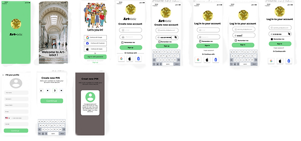
Wireframing and low-fi prototype
Once the flow diagram was established, I started sketching with pen and paper the low-fidelity wireframes of the main user flow. The initial wireframes were made to adapt to the Android user( as per Material design guidelines).

Making mockups and Hi-Fi prototype
After conducting a usability study on low-fi prototype, I started creating a couple of the main user screens of the app. Choosing a typeface and set of colours were the two most important things towards this direction. I created a sticker sheet for my use and to maintain consistency. Thus, for colours I use Material Design Colour guide to get primary and secondary colours. Then I created typography scale to ensure that the hierarchy throughout the project is preserved.


Usability Study
After the prototype was created, I was not sure whether this app is usable and useful. Therefore, I ran a mini usability test and tested it on 5 users. I made a research plan in which I outlined research goals, questions- I wanted to know the answers from, KPI's, methodology, information about the participants, and a script with tasks to complete. This was tested in a remote and unmoderated usability study.
After the usability study, I asked the participants to complete a short questionnaire so that I can understand how smooth was the guide booking process.
Round 1 Findings
Study Findings
1. Based on the theme that users are having difficulty in navigating a 'create new account' page, an insight is users need a more prominent button to create one.
2. Based on the theme that for most users is not immediately clear to decide on the guide an insight is users need a rating score, placed behind the guide’s photo.
3. Users need a date and time slot on the booking page.
Round 2 Findings
1. The sign-in button on the first page does not help the users.
2. Users wanted to see the price of booking for each guide.
3. Users wanted to contact their chosen guide before their visit to the gallery or Museum.
Affinity Diagram
After collecting insights from the participants, I made an affinity diagram to organize a large number of scattered ideas into their natural relationships.


Participants expressed dissatisfaction when they could not find how many people rated the guide in the guide availability screen. 4 out of 5 participants opined that they could not take an informed decision about whether they choose any particular guide or not. The ratings are not useful without the number.
Also, the inclusion of a global navbar at the bottom of the screen makes it easy for the user to directly contact the guides they had chosen.
Iterating on the findings of first Usability Test
In the previous design there was no in-app date and time booking facility which makes the user frustrated.
5 out of 5 participants expressed concern about a date and time slot booking facility, without which they could not complete the task.

Before

After

Before

After
4 out of 5 participants had difficulty noticing the sign-up button. Therefore, it requires the use of colour which could draw user's attention. I have changed it, from black to green.
Iterating on the findings of Second Usability Test
I observed in the second usability test that 3 out of 5 participants expressed frustration when they have to fill up this form in the signing up process. That is why I included only two input areas.
It would decrease the friction rate, while increasing the user conversion rate.

Before

After
Branding
Final design and UI design ideation process
-
The UI design went through a couple of changes. The first version was too clean and straightforward for a guide booking app, so I started to explore museum guide booking app on the internet, I found several travel advisor apps rather than direct guide booking app. I also visited many websites of art galleries and museums. It occurred to me while musuem websites largely based on nude colors, travel guide apps used vast range of colours.
-
Then I choose the icon of the app and picked the primary and secondary colour from the icon. For the icon I chose Van Gogh's one of the most common art work- The Sunflower.
-
I started the branding process by brainstorming different names for the app. The name 'All Arts' and 'Artistic' were on the priority list and finally decided on Artistic as it expresses a quirkiness yet related to art. This name, I think, could be easily understandable by the users as a relevant app.
-
As for the typography, keeping the font simple was a priority. For titles, I used Work Sans and Ultra. For selecting font sizes for different header and body text, I consistently used golden ratio.
-
Buttons are represented in Green colour(HSL Code 75D78B). Overall, the goal with branding was to create a simple yet modern design.


Iterated Prototype
After iterating for the second time I made a prototype that could be live pre-viewed here.

Iteration after third Usability Study
After the third Usabilty Test , I found users were mostly successful in booking a guide. However, 10% of the testers wanted to visit the official websites of the museums while using the app. While another 15% wanted a downloadable map to use it if internet interrupts. I iterated on the above mentioned design issues and made adesign changes for the fourth time. Here is the new mockups.


Considering Accessibility
The App has been evaluated for contrast to match at least AA standars. Every frame was checked with contrast checker tools, such as the Figma plugin 'A11y-Color Contrast Checker' and then by hand with the 'Contrast Checker' by WEBAIM.
Initially, this App failed the WEBAIM contrast checker test because the white text on the green button has a contrast ratio of 2.8:1. After replacing the white text with the black one it succeeded as the contrast ratio is now 7.48: 1.
Later I changed the primary color from #75D7B to #00C295. The new contrast ratio is 9.15:1.

What I Learn
While checking the color contrast for ensuring the design to be accessible, I learnt there are other considerations I need to take other than color contrast. I learnt about JAWS (Job Access with speech) which is a computer screen reader program for Microsoft windows.
I also learnt the importance of visual hierarchy and design systems in making your design clean and consistent.