
MediBook
MediBook
MediBook is an app that helps people schedule medication and set an alert so that it can remind people to have medicine on time.
Project Overview
A NY Times report says that about 60% Americans says they forget to take medicine. It has been a longstanding problem, particularly for patients with chronic conditions. The drugs they’re prescribed are intended to prevent costly complications, reduce hospitalization even keep them alive. It is called medication non-adherence. I'm aiming to design an app which would help reduce medication non-adherence.
Tool Used
Figma
Project Duration
Three months
My Goal
Design a mobile application first website that will help increasing the percentage of people taking medication on time. Also, in this way the app would help people to adhere to their doctor’s prescriptions.
My role and responsibilty
My role was a UX researcher and designer, leading the app and responsive website design from conception to delivery.
My responsibilities include interviews, making paper and digital wireframes, low and high-fidelity prototyping, conducting usability studies, accounting for accessibility, iterating on designs, and determining information architecture and responsive designs.
Research:
I explored that almost 50% of people in the United States struggle to take their medications as prescribed. Taking medications can get harder when people have to take more than one medicine. Now the question arises why people could not adhere to their medication schedule. World Health Organization in one of its reports commented that medication adherence is not exclusively the responsibility of the patient. While searching for possible solution to tackle this problem, WHO discovered that medication-taking behaviour is complex and involves patient, physician and process components.' Solutions include encouraging a 'blame-free' environment opting for less frequent dosing, improving patient education, assessing health literacy and paying attention to rational non-adherence.
A 2003 report published by WHO shows that adherence rates in developed countries average only about 50%. Of all medication-related hospitalizations that occur in the US, between one-third and two-third is the result of poor medication adherence. Here, comes the importance of a medication reminder app. Though there are several of these kinds of apps available in the market, however, I think the incorporation of one feature could make Medibook unique in its treating the problem - that is a feature which could enlighten the users, from time to time, about the hazardous effect of non-adherence of medicine. To counter the non-adherence related to perceived side effects, adverse drug reactions, health literacy, characteristics of the disease, the app could also educate the user about the drug form the prescribed medication plan. For this, there will be access to a large worldwide database of documentation about medication in circulation.
Competitive Analysis:
I research the services that current medication reminder apps offer to users. Most companies have a similar system of drug reminder app. Here I have analysed three direct competitors of MediBook. These are Medisafe, MyTherapy and Dosecast.
While using these three apps users have to simply enter basic information about each medication they take, such as name, dosage and how and when they are taking it. Users can set up reminders on a daily/weekly/monthly schedule, every few days or weeks, or for a pre-set number of hours or days after the last dose.

Dosecast
1.MediSafe is Android and iOS compatible while also accessible on Apple watch.
2. Users can add a Medfriend or dependent to their account so that they can watch over their scheduled medication.
3. Users can add their prescribing doctor into their account and share the doctor their progress report of the medications they prescribed.
4. Users can also add their doctor's appointment in their app-based notepad.
1. This app is accessible to iOS, Android and Amazon devices.
2. It adjusts to the users' changing day, enabling them to take a dose early or postpone it as long as the user needs.
3.As the user takes doses, Dosecast tracks remaining quantities sends refill reminders and logs medication adherence.

MediSafe

MyTherapy
1. Available in iOS and Android.
2.Users can add their family members so that they can keep track of whether the users are taking their medicine or not.
2. This app is accessible in seventeen different languages. Therefore, it has a larger audience.
Understanding the user:
I used data on scheduling medication to develop interview questions, which were then used to conduct user interviews. Most interview participants reported feeling badly missed medication, but they didn’t actively try to set reminder. The feedback received through research made it very clear that users would likely to set reminder if they are provided with an easy to use app which will also help them remembering the time when to refill prescription.
User Research:
I interviewd a few people to understand their pain points. I grouped these people into two categories- one group represents elderly people(mostly retired) who are not that tech savvy. They wanted to use an app which would be easy to use. Other group represent people who were middle aged working adults and have been using technology for their daily needs.
_edited.jpg)
Persona 1:
Emile:
Problem statement:
Emile is a busy adult who needs to set an alert in her phone in intervals
because she wanted to be remembered when she has to take medicines.
Persona 2 : Priya
Priya is a retired professor and a caregiver
who needs a way to remember when to take medicine everyday because she became forgetful.

Brainstorming phase
Crazy Eight
I did a quick ideation exercise to come up with ideas for how to address gaps identified in the competitive audit. My focus was specifically on medication reminder and refill reminder features.
_edited.png)
Sitemap for responsive webpage
With the app designs
completed, I started work on designing the responsive website. I browsed through the internet to see how these types of app have their websites and drew inspiration from that. The sitemap help to guide the organizational structure of each screen’s design to ensure a cohesive and consistent experience across devices.

Sketching
After the flow diagram was established, I started sketching with pen and paper the low fidelity wireframes of the main user flow. The initial wireframes were made to adapt to the Android users (as a form of following the Material Design’s guidelines).
I created basic sketches of each screen users would see in the key pathways, considering what information and design elements were necessary for successful completion of the task. Sketching allowed for continued brainstorming and iteration in a flexible, low stakes environment and helped craft the visual hierarchy of my screens.
I also sketched low-fidelity wireframes for the responsive website with desktop screen in mind. This allowed me to understand different designs dor different screen variations and design decisions I wanted to take.


Digital wireframing
After ideating and drafting some paper wireframes, I created the initial designs for the MediBook app. These designs focused on delivering personalized guidance to the users to help manage their medication.
After making the initial wireframes of the mobile app, I made low-fi designs of the responsive website for desktop and tablet version.


Creating the Design System
After conducting the competetive analysis I have realized that medication reminder apps largely used blue as their primary colour. I choose the same because blue is the colour of peace and health. For choosing the typefaces and font I used golden ratio method. For making responsive grid system I followed Google's material design guideline.
I referenced Gestalt principles in creating common regions within various sections, similarity to establish functions of different elements, and focal points to create call to action buttons. I produced multiple versions of various screens, iterating on distinct aspects of the app including colours, and layouts, referring back to industry standards and best practices before arriving at my final design.


Designing mockup screens:
In creating high-fidelity screens, I strove for minimalistic designs that utilized white space, had low cognitive load, and were not only intuitive to use but also pleasing to look at.

Designing Low-fi screens for responsive website

After completing designing the mockups for mobile application, I made a sitemap for the responsive website. Now, I started designing the website for various screen sizes.
Usability Study:
I conducted five remote unmoderated studies to see potential problem with the design that the users might experience. I built a prototype and created three task to test the usability of the design.
Usability Study Findings:
No notification for successful setting of reminders
Users had difficulty understanding whether they have added medication reminders successfully.
Setting the date
For some users it is difficult to set the reminder using the calender feature.
For Repeated use
Users are dissatisfied to go through the same process again for adding reminders for the second medicine.
Refined Mockups
Based on the insights from the usability studies, I applied insights and changed calender feature with dropdown menu.

Hi-fidelity Prototype
The high-fidelity prototype followed the same user flow as the low-fidelity prototype, including design changes made after the usability study.
View the MediBook mobile application's high- fidelity prototype here.

Hi-fi prototype for desktop and tablet
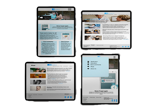
After iterating on the usability study result many aspects was clear and the app design was changed a bit. Reflecting on the test result I also made some changes in the responsive website for desktop, tablet and mobile. Here you can check out the live prototype of the website for desktop.

Accessibility
The initial colour that I chose for the app failed to comply with the WEBAIM Colour contrast test. It was 2.79:1. I spent lot of time and energy trying to make my design accessible by meeting AAA contrast compliance. I have to reconsider the shade of blue and instead of HEX #7A1FA, I chose HEX#047DCD, turning the contrast ratio 4.35:1. On the other hand the colour that I have chosen for desktop, tablet and mobile websites pass the WEBAIM AAA colour contrast test, as the ratio is 14.39:1.
Next Steps:
I need to include labels for easy accessibility of screen readers.
Initial focus of the home screen on personalized recommendations help define the primary task for the user.

_edited.png)
Making Responsive Design
I have shared the homepage design in mobile, desktop and tablet. I have optimized the typography and design decisions based on different screen sizes.
Takeaways
While completing this project, I have gone through secondary research about the nature of medication reminder app and learnt a lot from it. I also create a component library which helped me create consistent designs and save a lot of time. I now have a better appreciation for just how important this and a style guide are, especially as an app or brand scales or moves to different platforms.
Though the colour I have chosen for the responsive website complied with the AAA contrast ratio, for the colour I used in the mobile application design, I needed to reconsider my choice. I end up implementing a newer shade of blue for the AA compliance, but this led me to think more about other accessibility issues in designing web applications. Now, I wanted to make my design inclusive and changed my design aspect- How can I design inclusively from the very start? This has changed the way I will approach design in the future and will improve my designs for everyone.